XiltriX North America
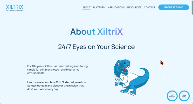
XiltriX North America provides environmental monitoring solutions for the life sciences industry, helping labs protect research integrity and safeguard valuable assets. They needed a major website refresh that could present complex scientific concepts in a clear, engaging way while feeling fresh, modern, and user-focused. The goal was to move beyond a dry, text-heavy experience toward a dynamic site that is easy to navigate, SEO-optimized, and visually distinctive with bright colors and abstract scientific design.
Animation
Graphic Design
Web Design
Web Development
contracted by Week of the Website
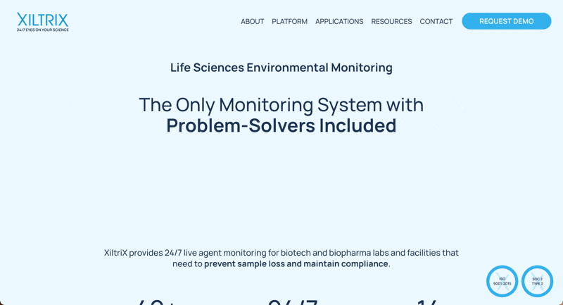
One of the client’s top priorities was to feature an EKG line prominently at the top of the website as a symbolic, eye-catching element. We designed and animated this line to feel dynamic and authentic. Although it seems simple, perfecting the motion required a lot of iteration and attention to detail. The client had a very specific vision, and we worked through many refinements to achieve the exact look and rhythm they were after.
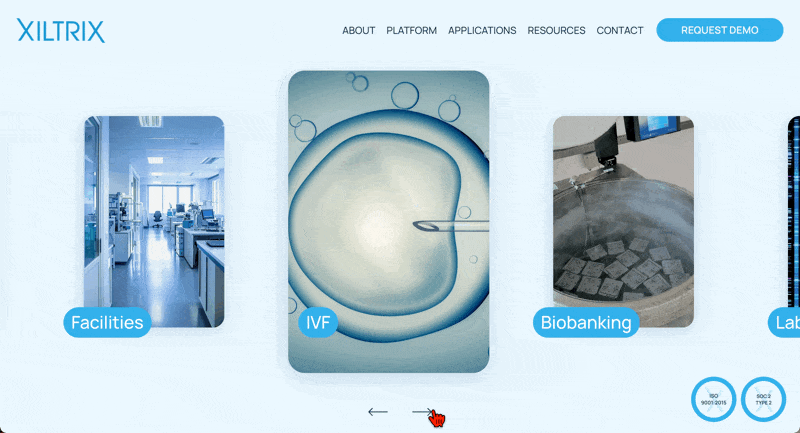
For the Applications section, we moved away from a static grid and applied a horizontal slider that allows users to browse categories one at a time. This approach feels more dynamic, keeps focus on each application, and encourages interaction. While it was a playful design choice at first, it ultimately gave the client a more engaging way to showcase their offerings.
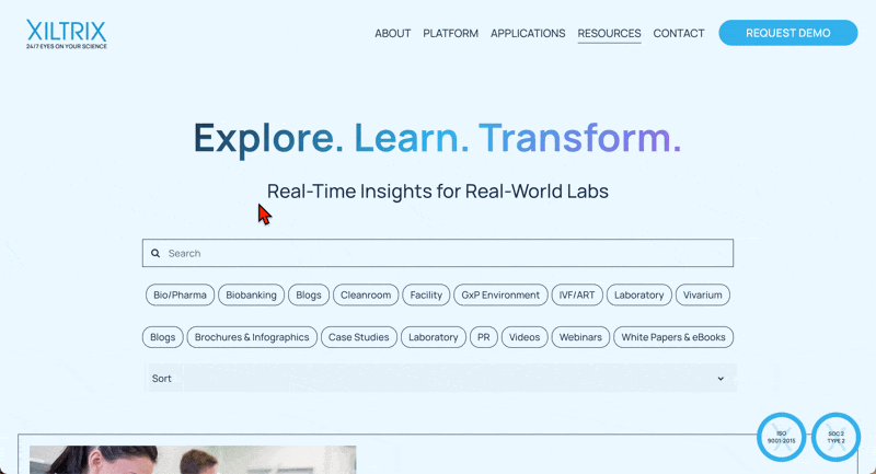
We migrated the client’s extensive archive of WordPress blogs into Squarespace. This was a massive undertaking that required significant cleanup and restyling since much of the formatting broke in the transfer.
To organize the content, we integrated a filter plugin, but the out-of-the-box solution wasn’t flexible enough for the client’s specific needs. We rolled up our sleeves and customized the code line by line until it matched the client’s vision. This part of the project took a lot of time, experimentation, and persistence, but it was rewarding to deliver a tailored solution that worked beautifully.
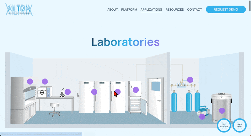
For the Laboratories page, we embedded an interactive map of equipment. Visitors can click directly on any piece of equipment in the illustration to jump to a detailed, anchored explanation below. From there, a quick ‘Back to Top’ link brings them right back to the map. This interaction makes exploring the equipment more intuitive and engaging, turning the page into a guided experience instead of a static scroll.
The client envisioned a sleek, glassy look across the site. To achieve this, we designed soft gradient borders that give each section a polished, translucent feel. We also built a custom timeline to showcase the company’s history in a clear, engaging way. Finally, we refined the scrolling experience so that transitions between sections felt smooth and seamless reinforcing the high-tech, professional tone the client wanted.